Pallet Knife Landscape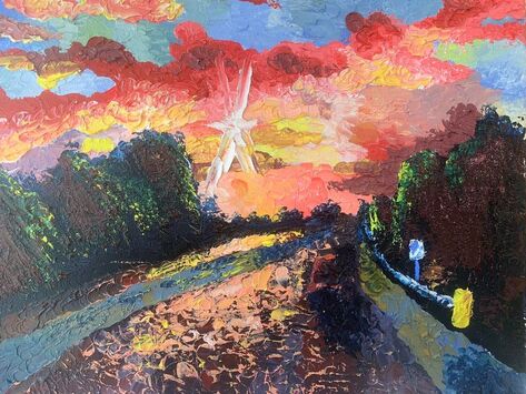
|
This being the first and only pallet knife pieces ive ever done I think that captures really good colors and lighting. something that I could have done better is maybe use different types and sizes of pallet knives so that I can create better texture and details in my pallet knife pieces. I would like to try to use this technique on other paintings in the future.
So I decided to paint the highway that I lived next to which is also the highway that Apex high school is on (Hwy 64) I took this picture driving to beaver creek a few weeks ago. I think that this improved me as an artist because I had to really push different lights and darks to show everything while also having to still keep the colors I wanted. 
|
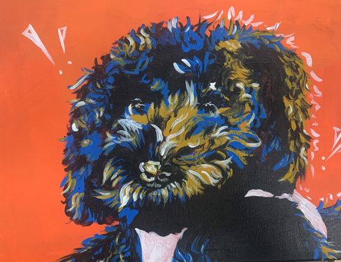
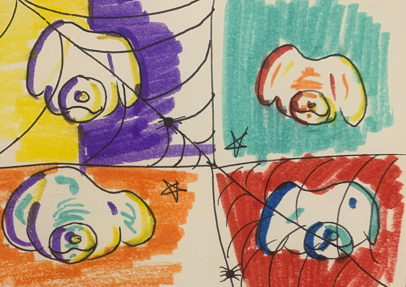
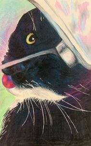
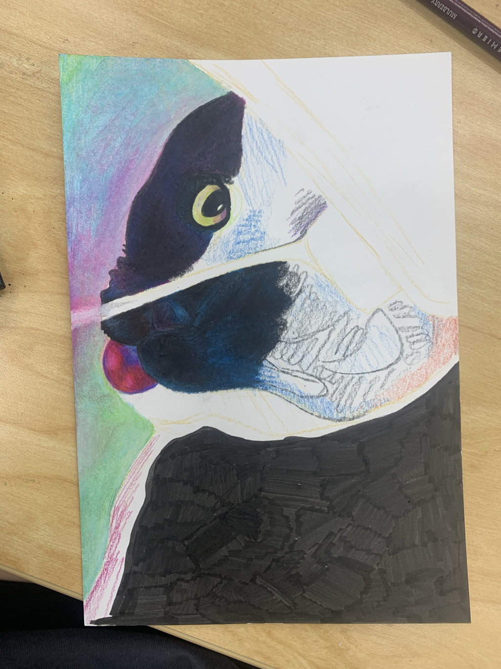
Pop Art Pet Portrait
|
For this project i decided to do my art teacher’s dog. I chose this idea because i had already drawn my pets many different times with many different mediums. I am not good at pop art style and i think that i did too much texture and ruined the piece over all. I also think that i messed up the proportions on the dogs face but it still looks good. It was hard to only use 3-4 colors for the whole thing. I think with future projects i should do more research on the style and plan more so that i can make it look the way i want.
|
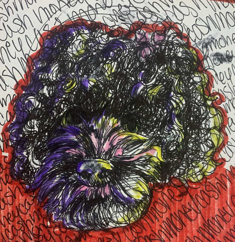
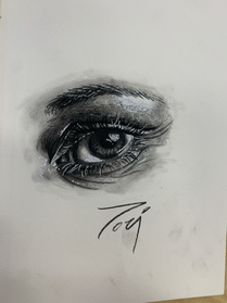
Sketches
|
|
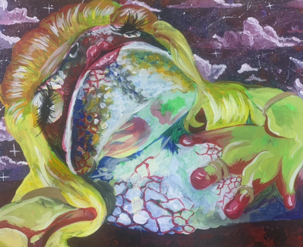
Ordinary to Extraordinary
|
This painting was inspired by one of my friends, she likes drag queens and she likes frogs so i decided to make a frog drag queen. This was challenging because i wanted to add as much color as i could. I was successful in that aspect i really like how it turned out. I didn’t do too much blending because i wanted texture.
|
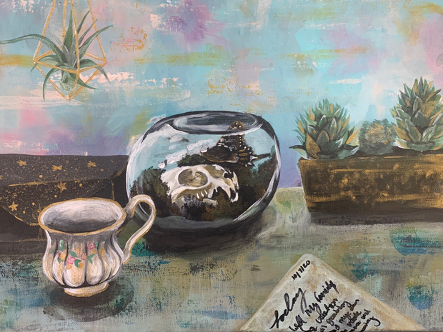
Interior spaces
|
I originally had another idea of creating a horror scene in storm drains inspired by my neighborhood storm drains but halfway through painting it i started to hate it so i had to think of something else instead and start asap so that my project wouldn't be late and i was thinking about doing skull but the inside of a skull has been done so many times before I just decided to do a desk scene with a skull in a display case. I struggled with shadows a lot with this project but i still think it came out well. I wasn't using a reference for anything more than the skill so it was pretty hard to come up with the rest let alone the shadows. I think that not using a reference definitely helped me bring out my style more. I used a very limited color scheme with mostly cool colors. I think that because this project was made last minute i did not execute any sort of composition which i can work on next time when i actually plan it.
|
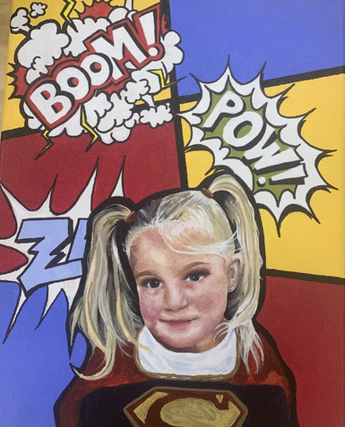
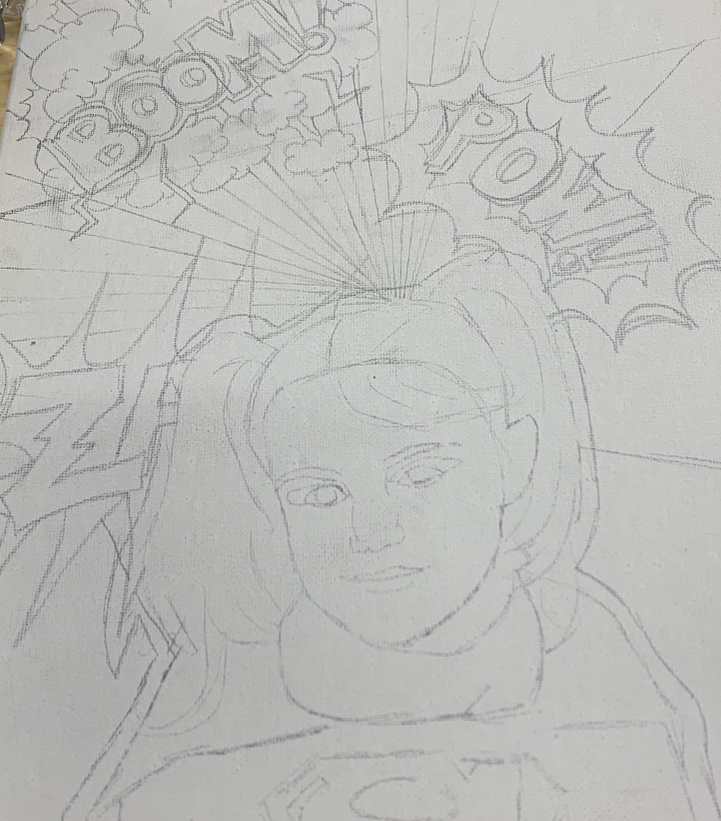
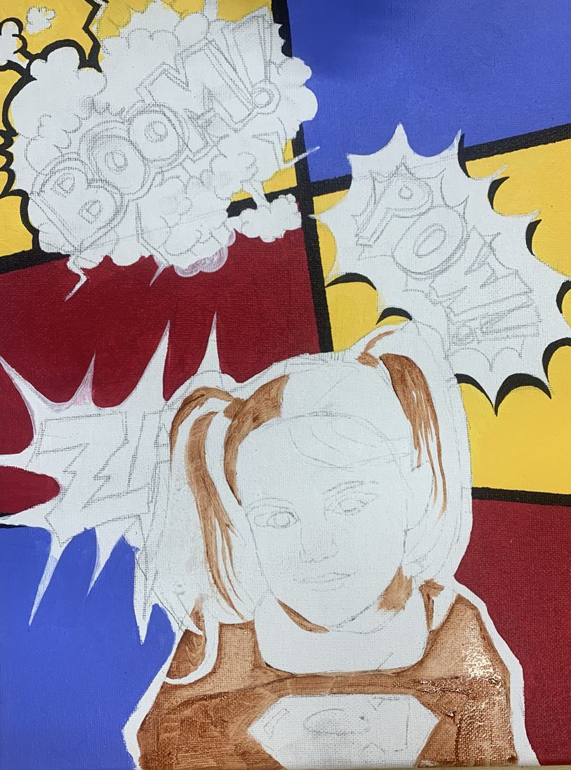
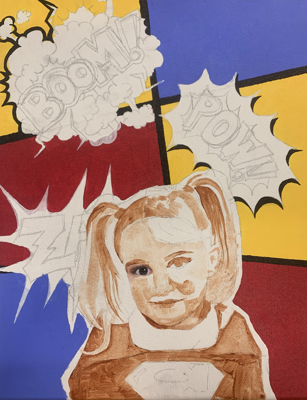
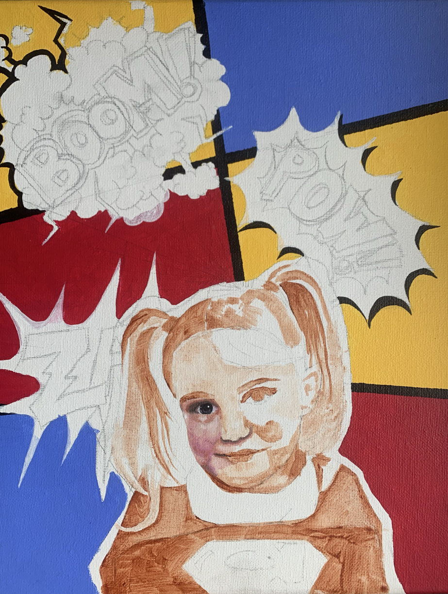
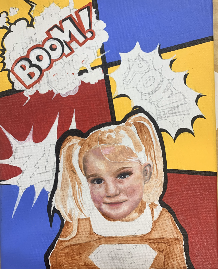
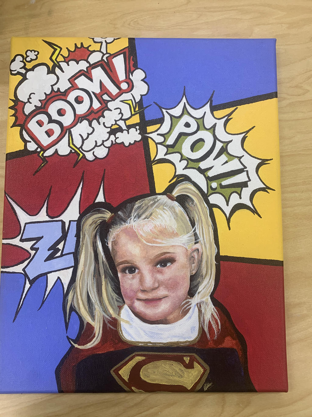
Self Portrait Project
Creating this painting was cool, because i usually don't work with so many flat colors. My goal was to make this painting neat and colorful and i think that i executed it nicely. I like that we used acrylic for the medium of this project because its really easy to create the opac flat colors i needed for the background. I like this picture of me a lot so when i found it and came up with the idea to turn the background into a comic book page i had to paint it. I think if i had painted myself in the comic book style it would have looked even more nice.
i'm very familiar with acrylic and i didnt learn much from this project just because ive used this medium so many times in the past. A technique that i ended up using was just a lot of layering to get brighter colors because the paint i was using was see through, especially the lighter colors. Overall i am happy with this painting.
i'm very familiar with acrylic and i didnt learn much from this project just because ive used this medium so many times in the past. A technique that i ended up using was just a lot of layering to get brighter colors because the paint i was using was see through, especially the lighter colors. Overall i am happy with this painting.
Progress Pictures
|
|
|
|
|
|
|
Facial Features Practice |
|
Reflections ProjectThis project really liked doing because previously i made a watercolor painting of this exact picture and i always wanted to recreate it in another medium. I put a saturated filter over the original photo pushing the undertones out to make a more colorful piece. I think i could have done better perfecting the sketch because i ended up tilting the head too much making it seem like he only has one eye. I like the white pen that i used for the whiskers, they look really good and realistic.
|
|
Progress Pictures
|
|
|
|
|

|
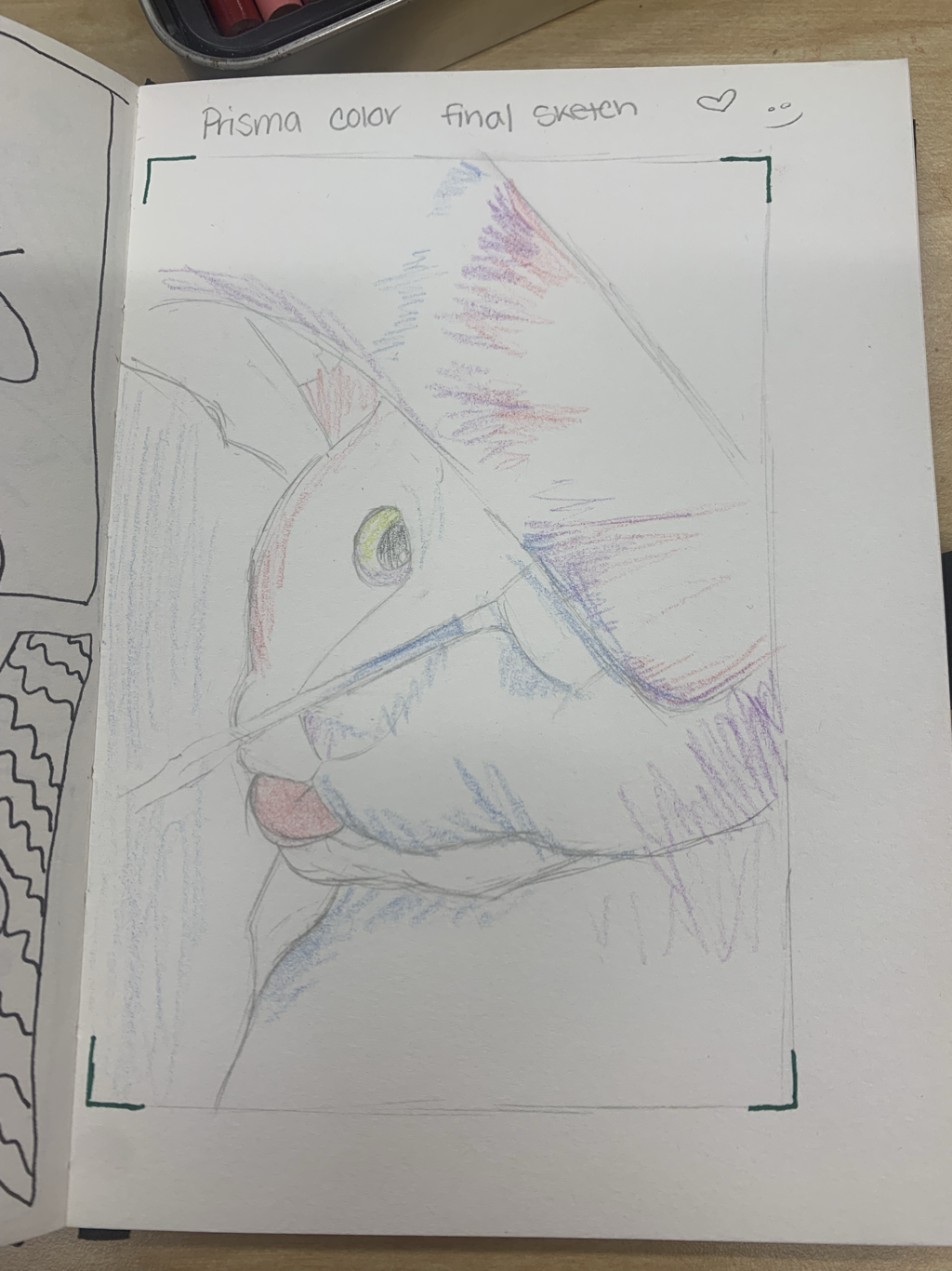
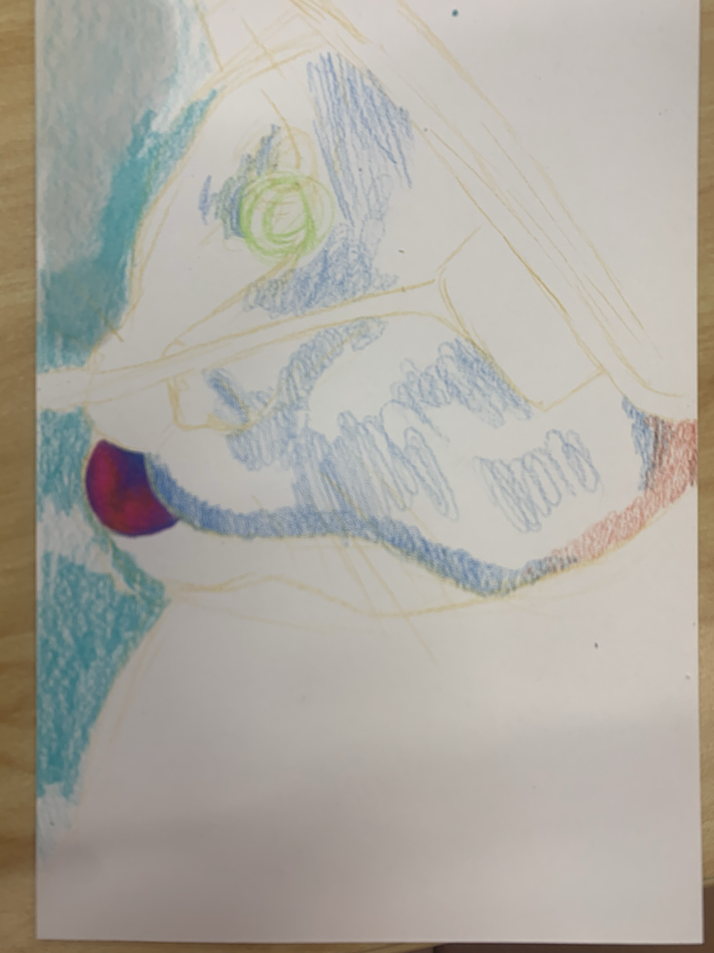
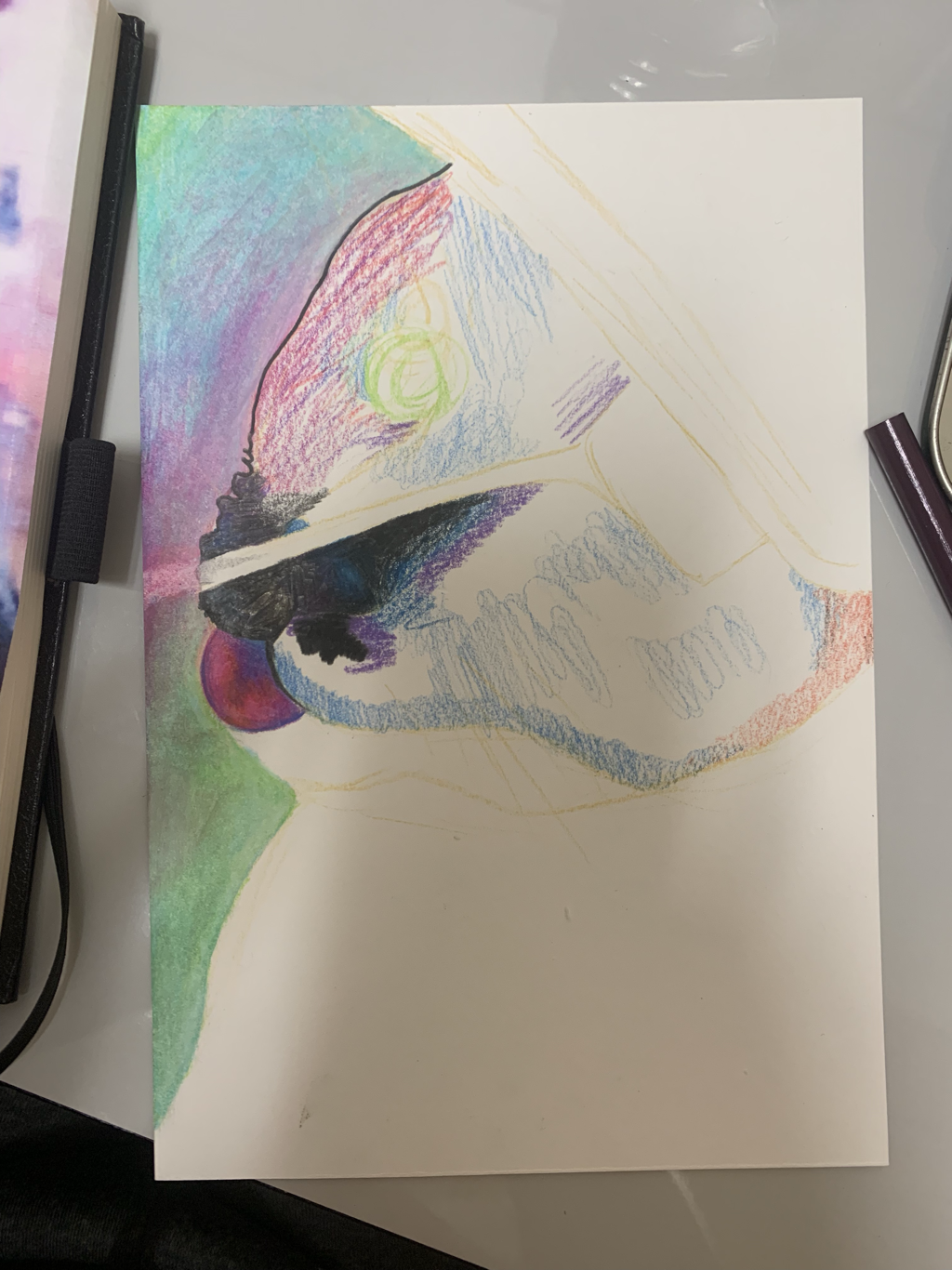
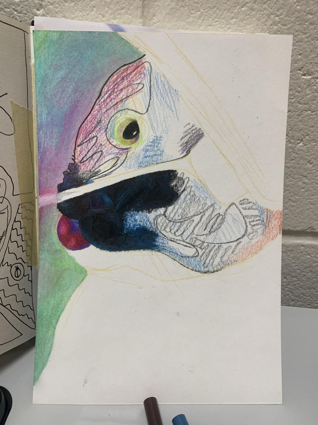
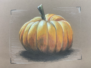
Colored Pencil Practice
|
We practiced using the prismacolored pencils to prepare for our prismacolor project. I wanted to practice drawing a pumpkin because I like how shadows look in the divots and bumps.
|
